Voyage
Ushering in a new heritage line
Client
Tocca
AWARDS
Top 5 Packaging Design Finalist in the Fragrance Foundation’s Awards 2018
Launched
May 2017
Team
Packaging design, packaging art direction, and photo direction by Cassandra Gerardo
Production design by Don Krogman
Photography by Atarah Atkinson
Styling by East Olivia and Cassandra Gerardo
Fabrication by Jansy
Background
TOCCA's iconic blue box candles had been a cornerstone of the company's product line for years, but the identical packaging and expansive fragrance offerings made product differentiation difficult for consumers. In addition, a separate existing hand wash and lotion line did not correspond with scents in the blue box line, preventing consumers from purchasing their favorite scent across bath and home products.
Challenge
The answer was to create Voyage, a new brand that bridged home fragrance, bath, and body. Embracing the brand's origins of travel and luxury, Voyage focused on immersing consumers in the fragrances of iconic and romantic areas of the world. New branding, primary and secondary packaging, and a romantic narrative were needed to visually unify the new line while still providing a complimentary look to Tocca’s existing lines, which had an ornamental, victorian feel.
Before Redesign
Although the boxes were an iconic blue, the candle scents were difficult to distinguish.
The visual array of home products did not feel like a cohesive set
After Redesign
Accomplishments
The new logo’s typography needed to complement Tocca’s existing use of Cochin. I began with the typeface Turquoise as my base, as its delicate curves and elegance, as well as its Mediterranean inspiration, felt stylistically cohesive with the brand. The abundance of ornate ligatures allowed me to create a playful interpretation of each scent’s destination as per the company’s request. Each became a logo in its own right, with ligatures and letterforms further adjusted by myself.
Unlike the feminine scalloped edging across Tocca’s fine fragrance and ancillary products, Voyage utilized a clean, minimalist vocabulary across its primary packaging. This provided a more modern and neutral appearance that would allow the scents to speak for themselves and avoid the pitfalls that limit choice in scents to matching interior color palettes. This approach also allowed the use of a standard set of primaries across scents, saving on production costs.
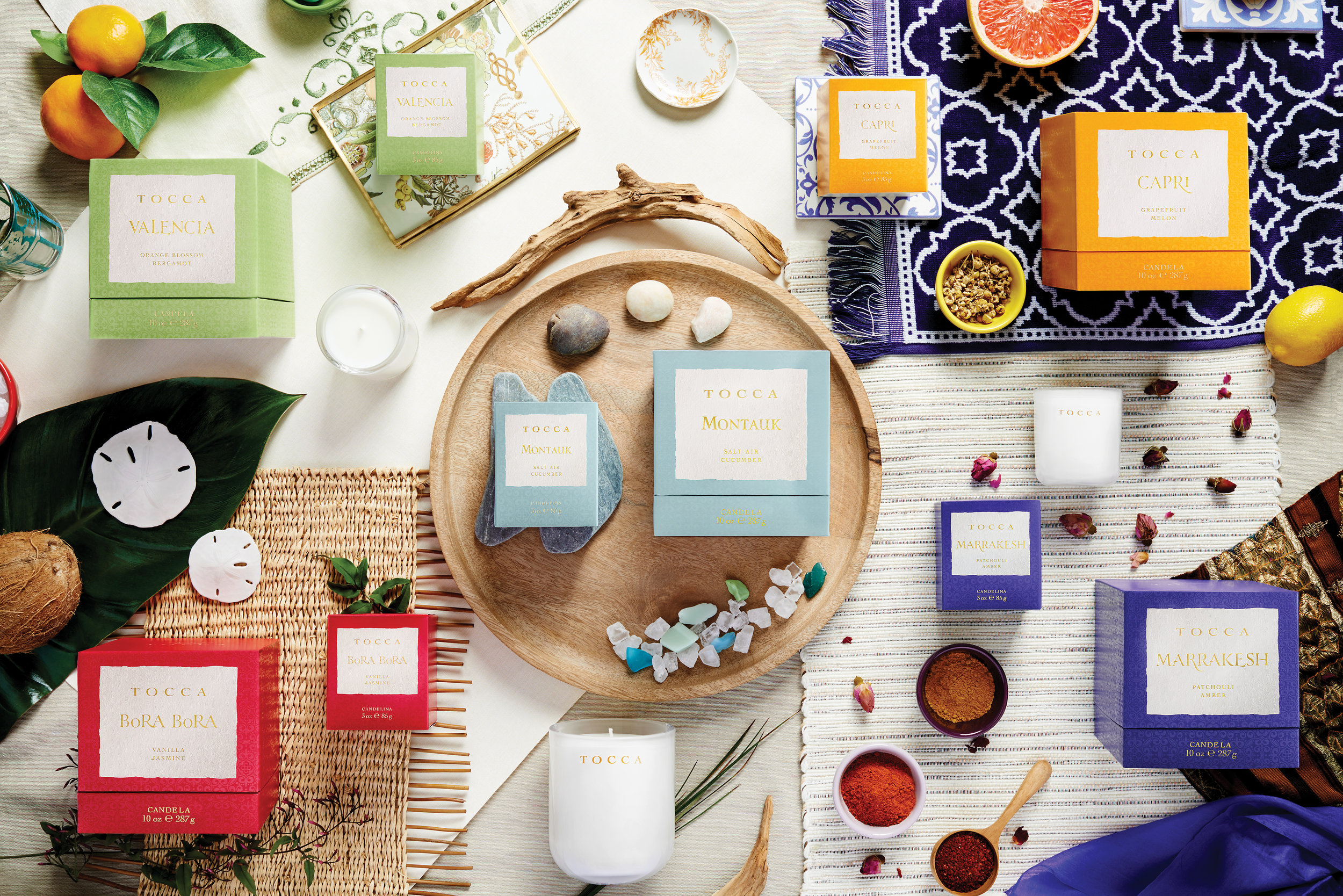
To counter the subdued primaries, colorful, eye-catching secondary packaging distinguished the brand against its retail competition. The boxes contain an intricate pattern — a nod to Tocca’s other product lines — subdued through the use of Pantone tints and a satin spot varnish to step off from the matte varnish over the rest of the box. Gold foil adorns select parts of the packaging — the same gold seen along the rest of the product line, and the use of a multilevel die provides texture on the front appearing as a torn label that harkens to a found note or letter lost at sea.
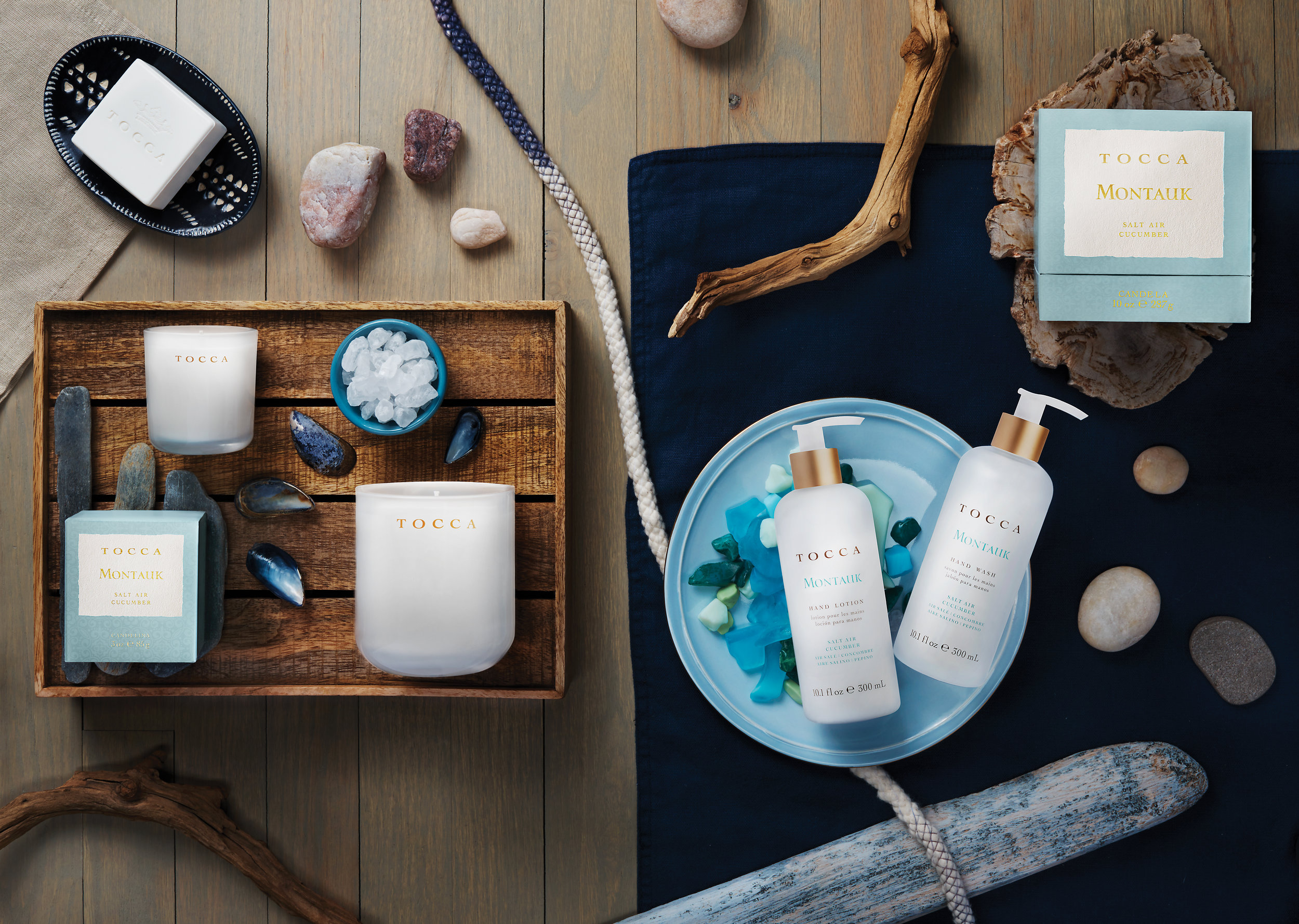
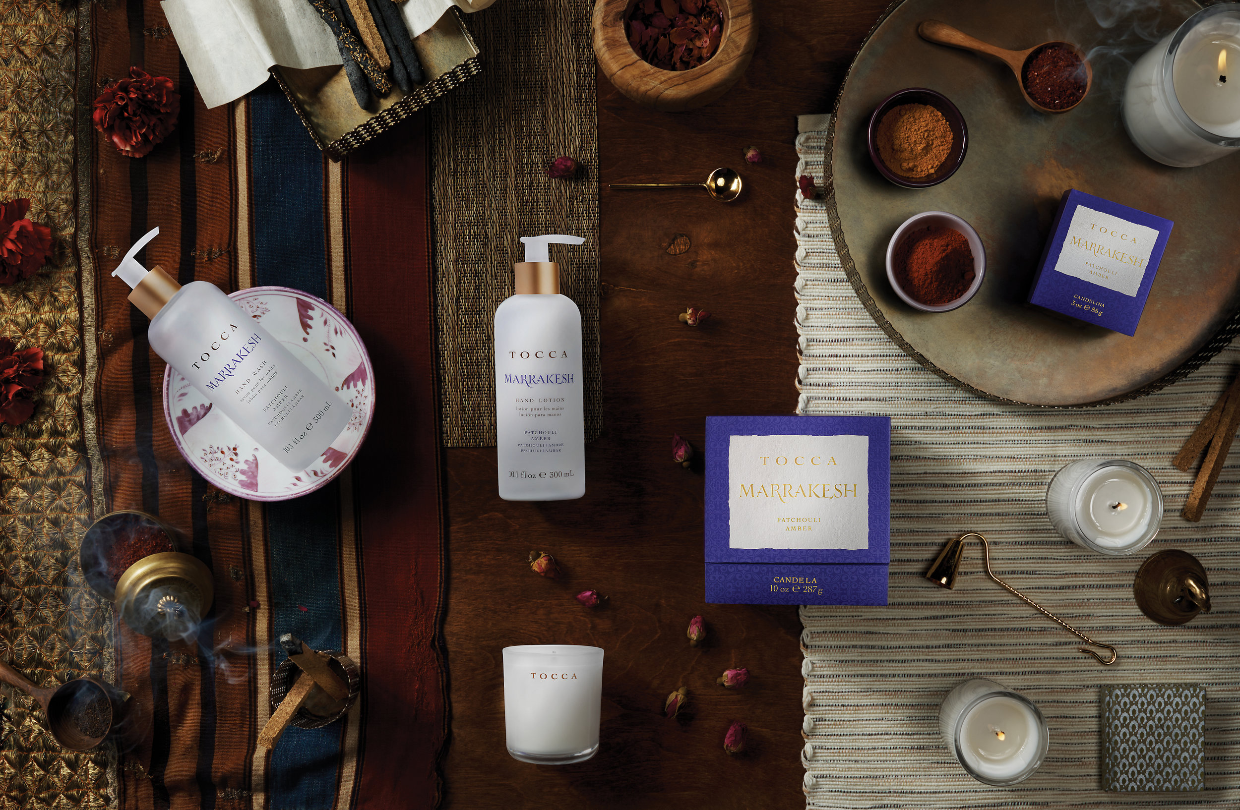
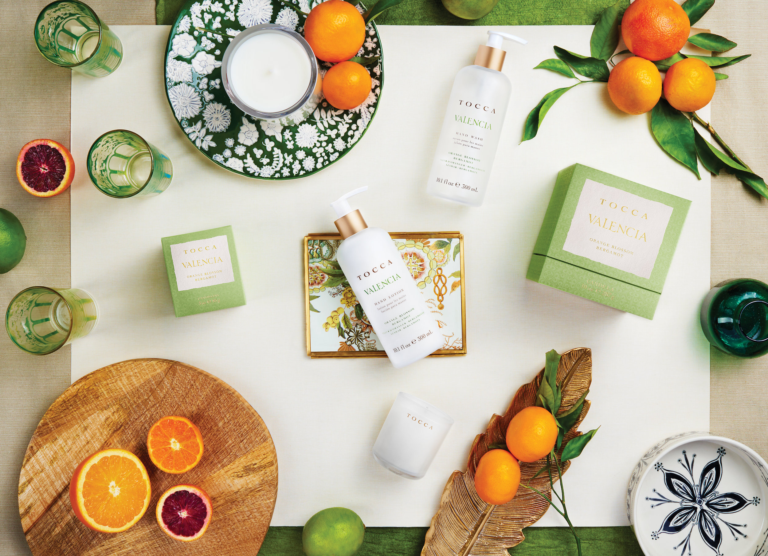
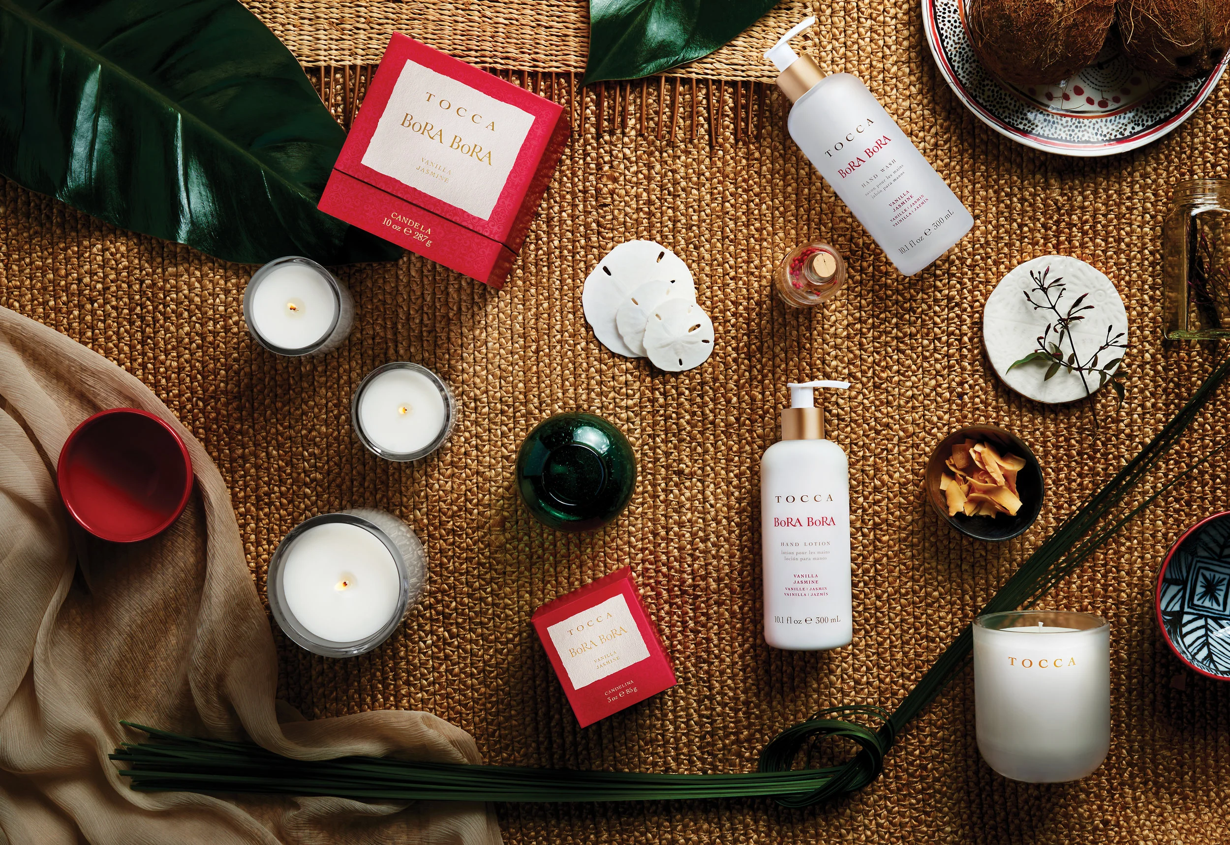
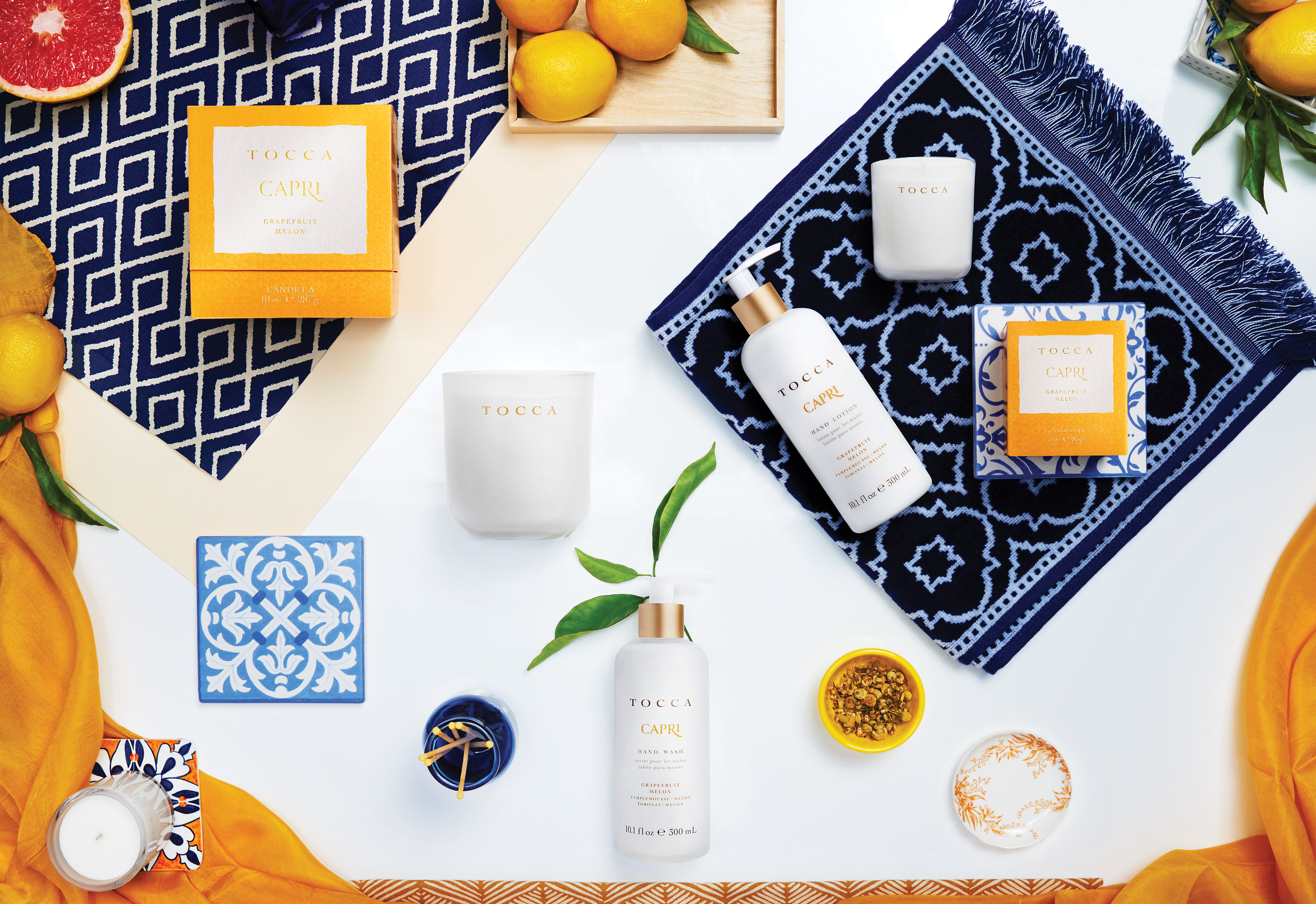
The marketing materials and photographs were where I could showcase the romanticism and wanderlust of the brand. Within a limited photography budget, my team and I were able to capture the personality of each scent’s destination through the styling of color, scent notes, and location-specific props. A second photo series shows the versatility of the primary packaging’s appearance as it transitions perfectly within each kitchen destination decor.


